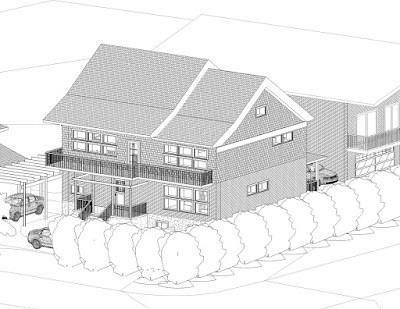
More experimentation with the roof. This design just below with the long balcony is the most developed with glass areas and overhangs carefully arranged to maximize solar gains in winter and shading in summer.
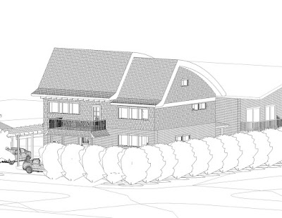
 This humped-back design increases internal volumes, and improves the roof angle on the south facade for best use of solar panels. The turned-up roof bottoms provide the needed overhang over the south glass. Not sure how much I like the appearance - give us your comments! - LT
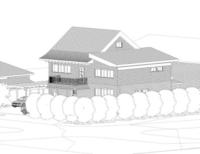
 I find this one quite interesting. It reduces the building's bulk at the street, which I think is useful, and introduces the gable peak as a delight a bit further back, bringing the window close to the attic spaces. The curved winglets play against the square form. Drawbacks include the much reduced ceiling heights in the main hall on the 2nd floor and a vacant-looking east exterior, which perhaps can be corrected with a wraparound south window.


No comments:
Post a Comment