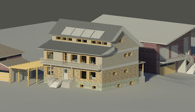
Overhangs and windows carefully arranged again. You can see we are still playing with the fenestration. The larger, curtain-wall style is nicer, I think. The windows will need to open inward, in order to avoid conflicting with the sliding screens - the balcony is very narrow anyway.
I would love to have the windows floor-to-ceiling, folding aside so the entire top floor becomes an indoor-outdoor space but alas I doubt that will be favourable to the energy demands - it would be hard to have the thermal break at the floor-to-balcony-to glass junction, not to mention the leaks and thermal bridges in all the window hinging points, - Have to look into that -
The sharp-edged roof lightens it up a bit, and achieves the needed projection without wasting vertical space. Custom, integrated gutters will be needed but are wanted since the normal gutters are really very weak and disposable, and no ladder can be placed against them - something needed to maintain those rooftop units. Somehow, these sharp edges will need to be balanced with the very thick-looking fascias on the gable ends.
The house does seem like a fatty to me. The balcony provides a constant overhang over the main floor glazing - (Balconies are not counted in lot coverage, provided they are not too large). The porch is therefore only partly covered. The front door glazing also serves to provide gain in winter, but none in summer.
Sliding screens and review of the external finishes and fenestration are going to happen soon.


No comments:
Post a Comment